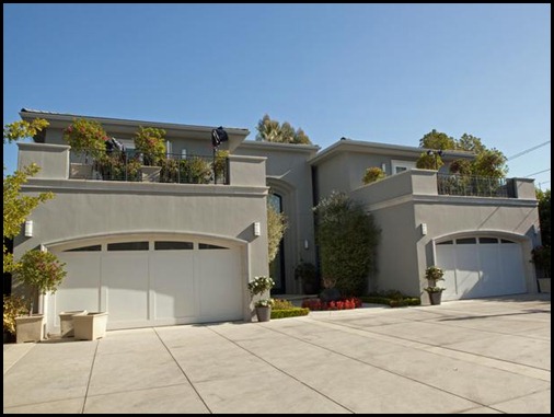
The show that made David Bromstad a household name is back for another season on HGTV on Tuesday nights. Are you watching this season of Design Star?
I tuned in for episode one last Tuesday and as usual with most first episodes I was not overly impressed. The rushed aspect of episode one drove me crazy.
Moving into a huge, ugly McMaison in Los Angeles (the show was relocated from NYC this season), the designers are always faced with designing various rooms in the home. Paired with other designers, the contestants try and meld their own tastes and styles (I would die). Personally, I would despise living in such quarters as the rooms of the home do not flow design-wise. There is no rhyme nor reason to their choices.
Can I say the home above is hideous?
Many folks have encouraged me since season one to send in an entry because I do love design and maybe a lil drama. I keep saying “no way” due to the fact that in no terms could I rush good design. I realize time limits are part of any design process but hours or couple days are unheard of in the “real” world. Much of the problem of shows like these is the instant gratification. I prefer shows like Sarah’s House where she buys a home and takes her time room by room.
In episode one, the wining room was:
What do you think?
The worst room (I do agree) is a big, ole hot mess designed by a local Bay St. Louis resident and another design star wannabe. I suppose the design was inspired by her love of Mardi Gras. Just look at the colors!
I think you can see why the designer of the room above was the first to go home. Just awful!
It is very early in the competition, but if I had to pick an early favorite of mine I guess I would choose Miera who at age 63 is from Del Ray Beach, Florida. Miera describes her style as seaside coastal. I may be partial to her style choice, of course. I’ll have to see how her designs come together in the next few weeks.
Tonight brings another fan favorite, the white room challenge. HGTV has even spawned this concept into another dismal hour-long show as part of its weekly programming. I remember that I first noticed David Bromstad after this challenge in season one; however, Alice Fakier was still my favorite from that entire show. Alice finished a very respectable second. Do you remember Alice?
Who is your early favorite?
Tune into Design Star, y’all!


I was pulling for David that season.
ReplyDeleteAlice Fakier, runnerup, now resides in Thibodaux with her doctor husband. Saw her at Jerome's one day.
xox
Honey
At your suggestion, I'll watch Design Star, but I'm not usually into angst ridden, frantic design programs. I get anxious enough trying to do my own decorating. Setting my reminder. :) Oh, I'm a Sarah Richardson fan, too.
ReplyDeleteBabs, I second that comment of yours! Frantic design is not my style either. Happy Viewing! xo
DeleteAlice is married to my 1st cousin's son! Loved her on the show! Sadly, can't say that I've been a faithful watcher- but you've sparked my interest again!
ReplyDeleteLoved Alice, too. I'm still surprised that HGTV hasn't figured out a role for her, since I think she is so much more interesting than some of their recent personalities.
DeleteI'm confused about where the producers are going this year. The move from NYC into that awful abode seems regrettable, and last night's white room challenge was more of a game show than a competition with capable, knowledgeable professionals. Kris's room was sad and scary, and Bex's room was anything but good design, even though the judges and the director seem to love her. And Stanley had a creative and inventive effort, but it was more of an art installation than a functional room. And to think that my first concern for my clients is to have a place to put a drink!
I too was again less than impressed. I wish it were design and not an art installation. I sure was not impressed with that floating sofa. Kris's room was awful. My 4 year old nephew could have done that! Who calls that design? Not me!
Delete